Basic Branding + Logo Design + Pattern:
AnnaGrace Photo Co.
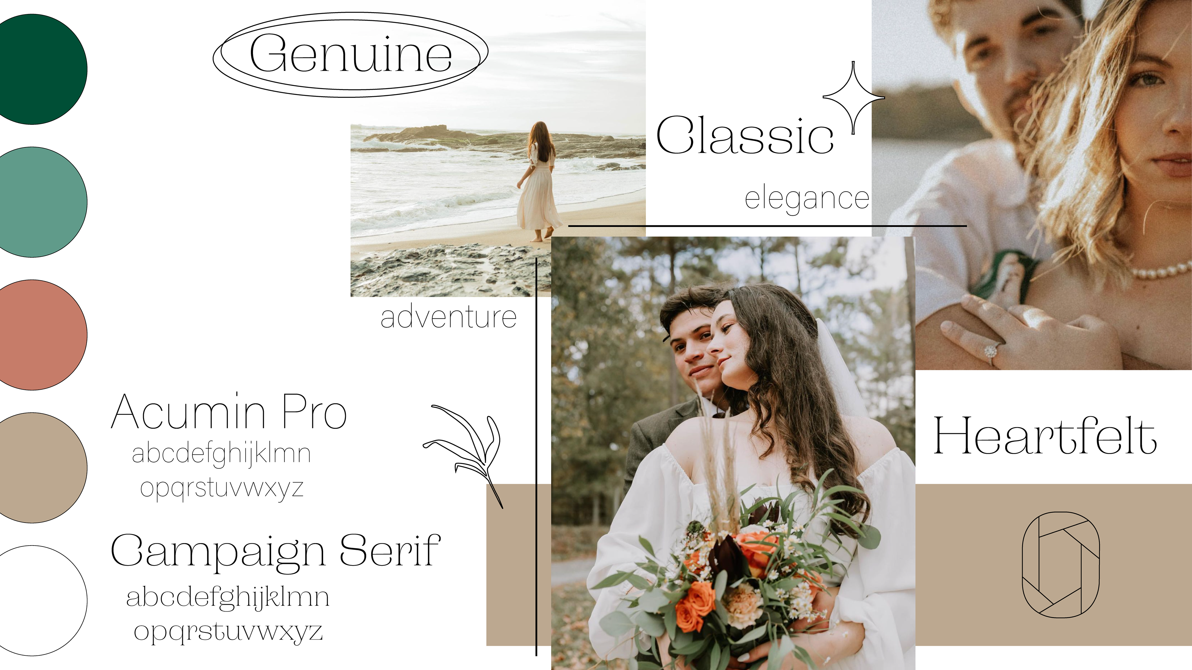
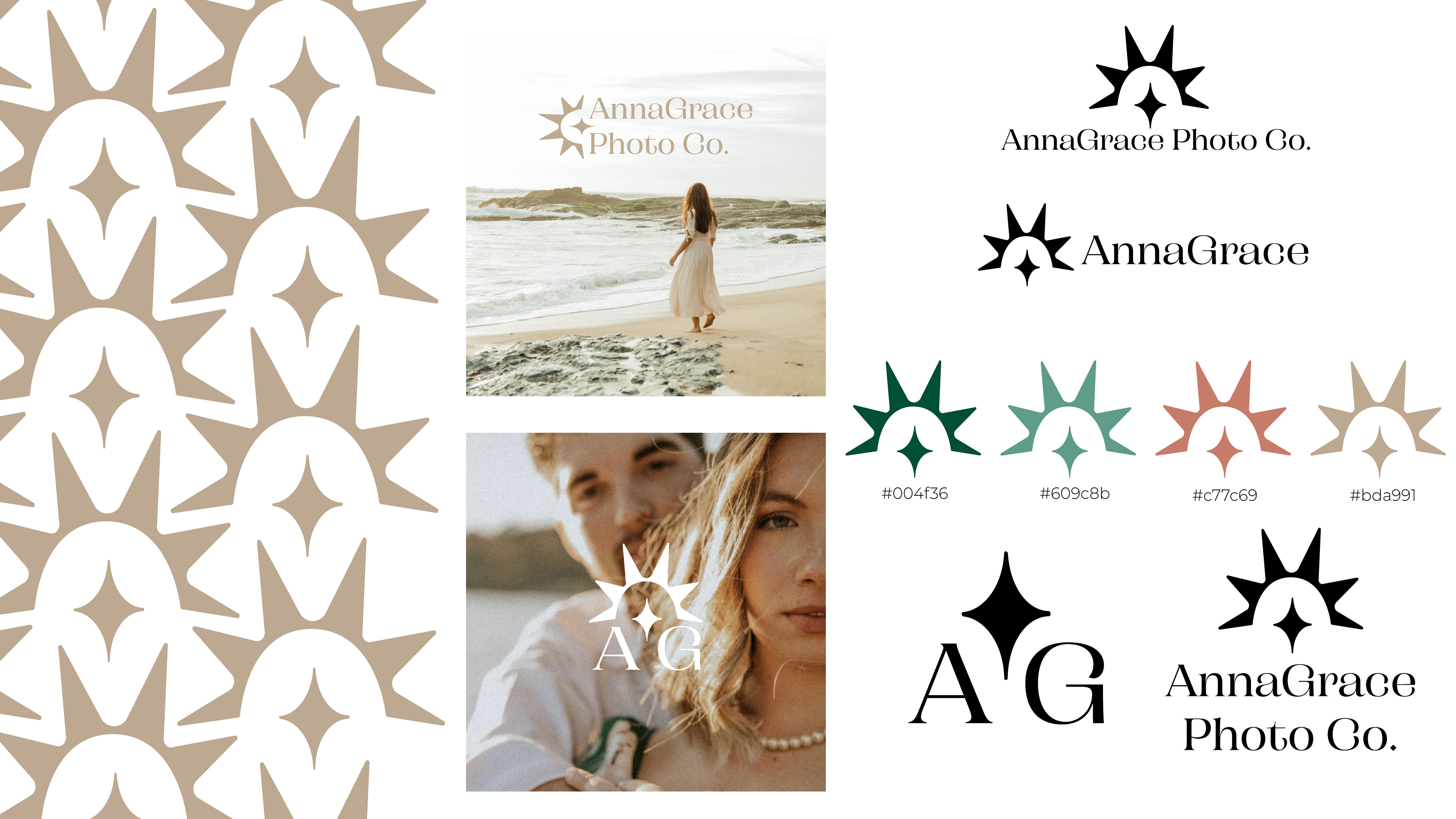
As with all projects, we started with a moodboard to encapsulate the brand. This contains AG's work, a custom color palette, typography choices, and a few line illustrations. This was the final moodboard that was decided upon before moving forward.
Logo Design:
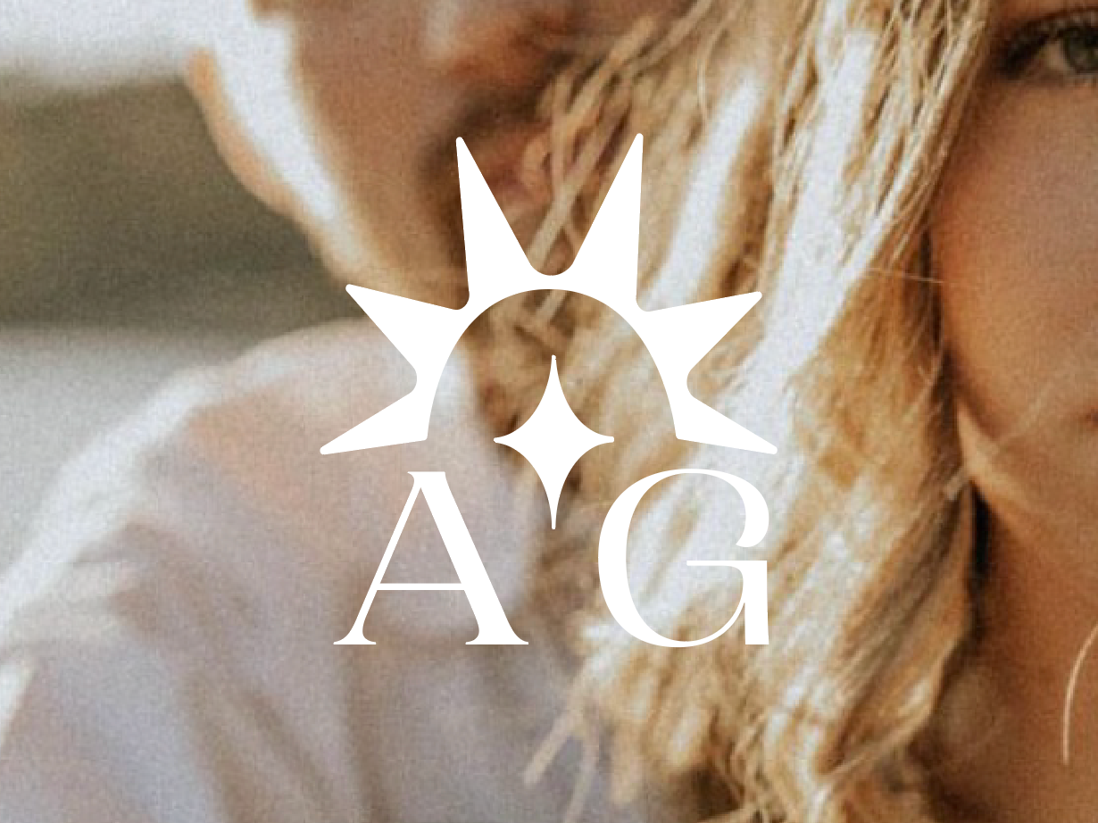
Words like "elegant" & "timeless" truly drove home with this icon.
I was inspired by both the "flash" on a camera, and the sparkle in the lens on a sunny day. After playing around with the rays and the sparkle, separately, I was drawn to fit them together. With just a little adjusting, this icon came together seamlessly. By smoothing the harsh edges, this design quickly became elegant and sophisticated, rather than harsh & contemporary.


This project consisted of multiple logo variations to be used in various ways. For smaller uses... like stickers, labels, and social media, we simply added the initials of "AG" representing "AnnaGrace".
I oriented the logo icon on it's side to best fit the full business name "AnnaGrace Photo Co". This orientation works perfectly for her website, posters, graphics, etc.


Branding Pattern:
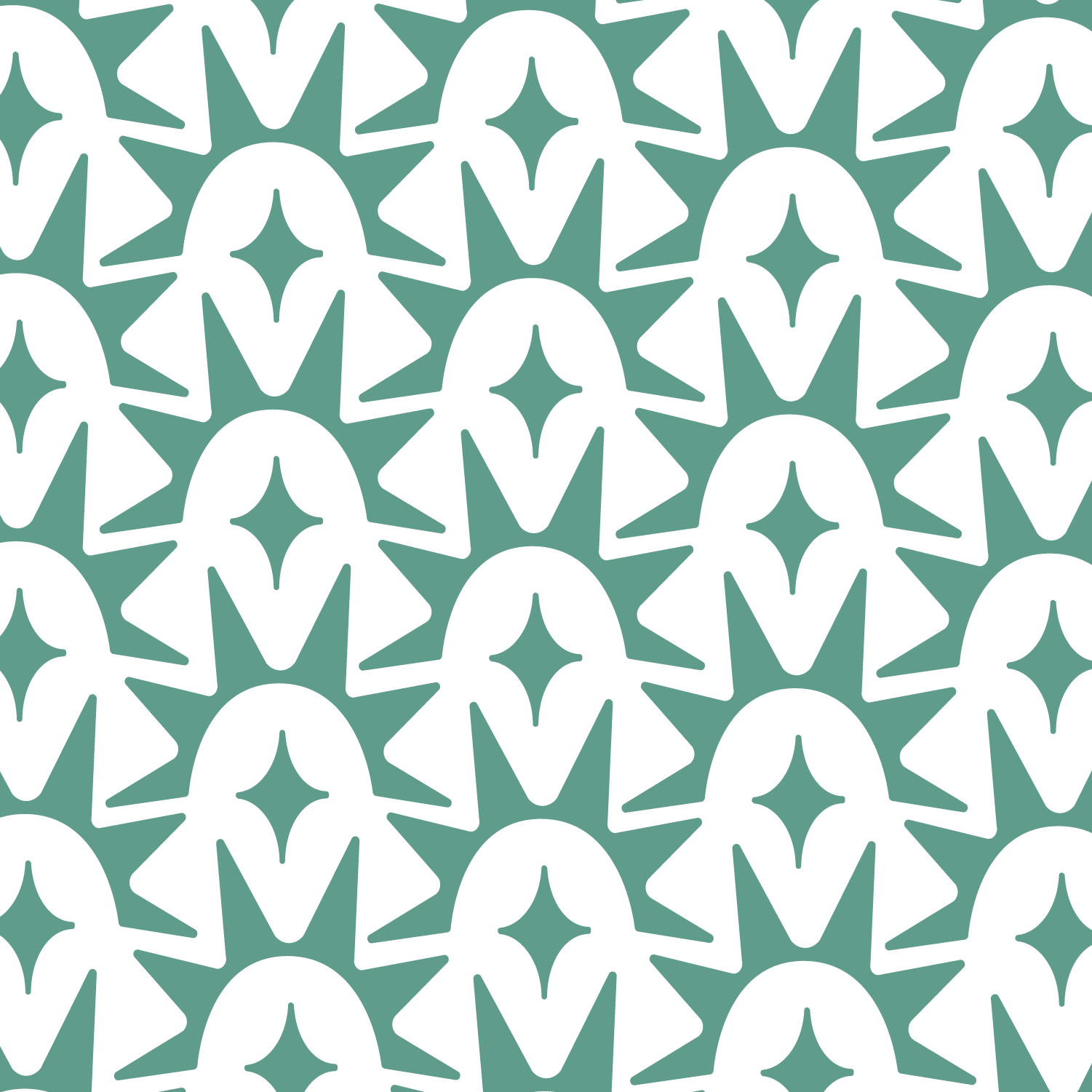
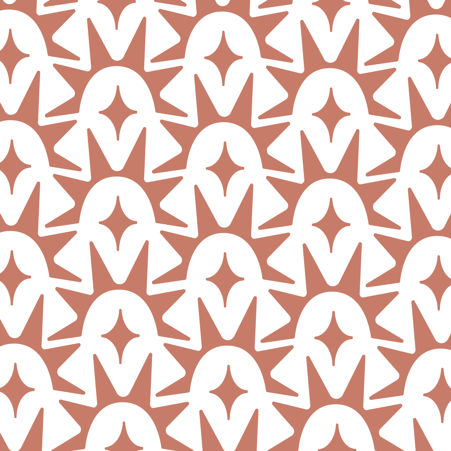
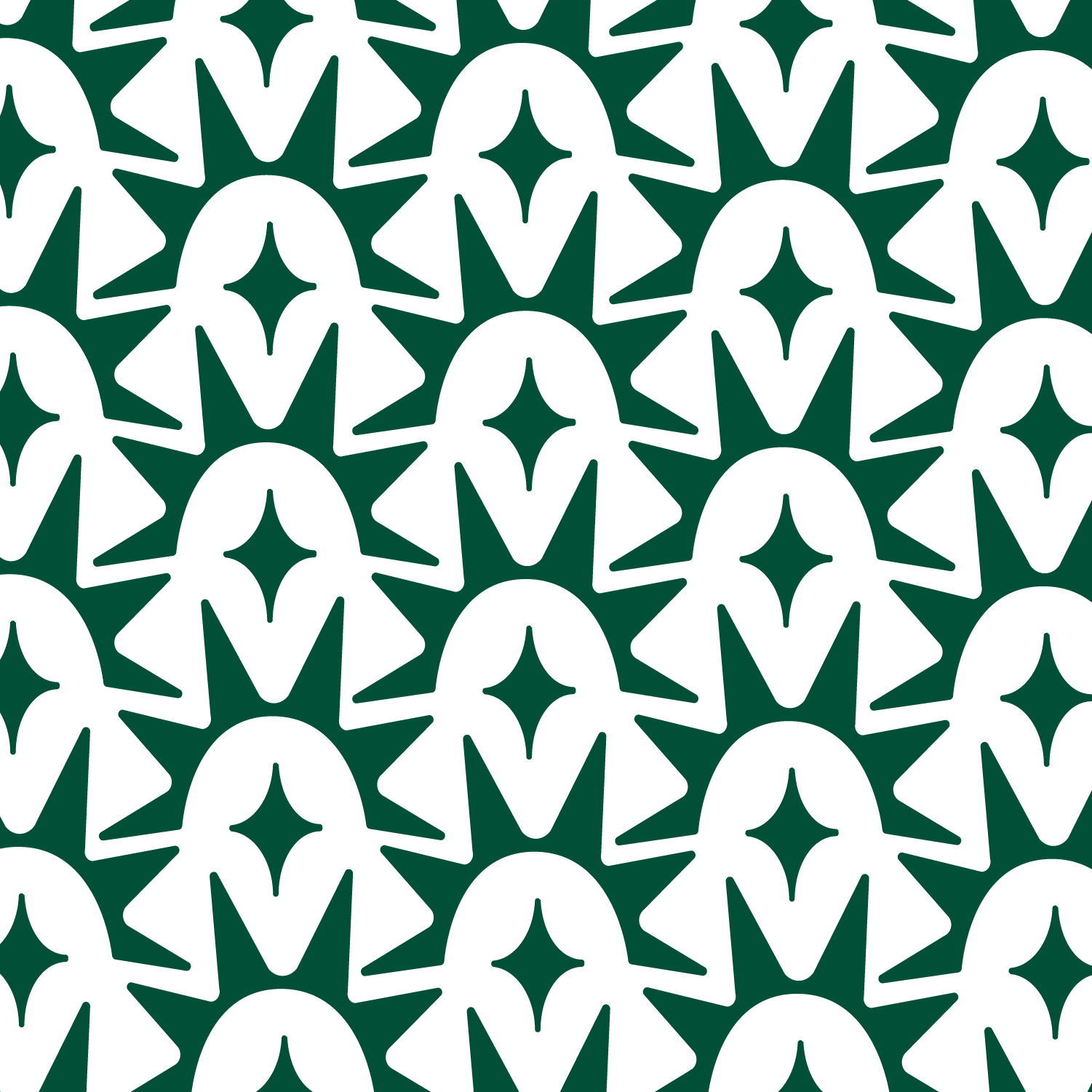
Patterns are useful for packaging, business cards, stickers, social media graphics, etc. Because of the geometry of this icon design, I was able to fit them perfectly together to create a pattern. A pattern of each color in her palette was provided to her for such uses.