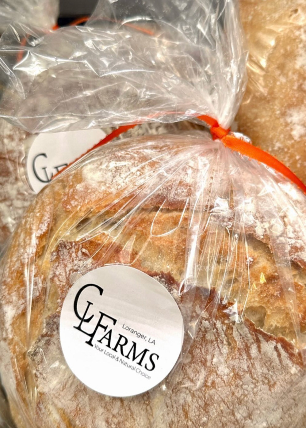
"Our goal at CL Farms is to be your local & natural choice for a more sustainable way of living."
- Colton (Farmer & Co-Owner of CL Farms)
The goal of the project was clear... Create a logo & basic branding for a local farm in Louisiana.
Color Palette:
When thinking through colors, we wanted to have a rustic feel & utilize color psychology to represent the core values of CL Farms.
By having a warm undertone to the palette, we are representing a family/community aspect that CL Farms is extremely passionate about. The green color helps bring in a natural/sustainable feel. And the rust color helps add the rustic element that they were looking for.
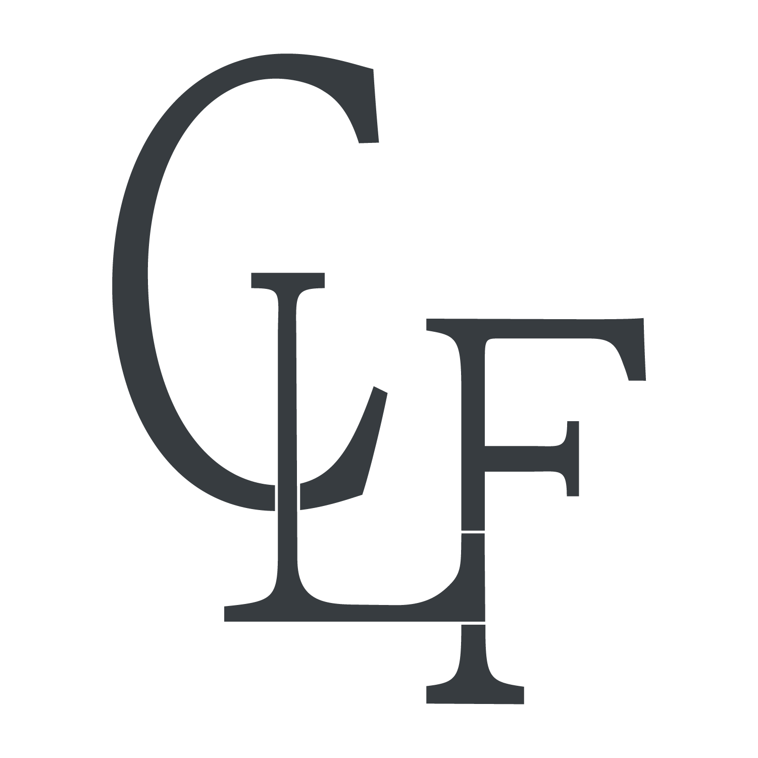
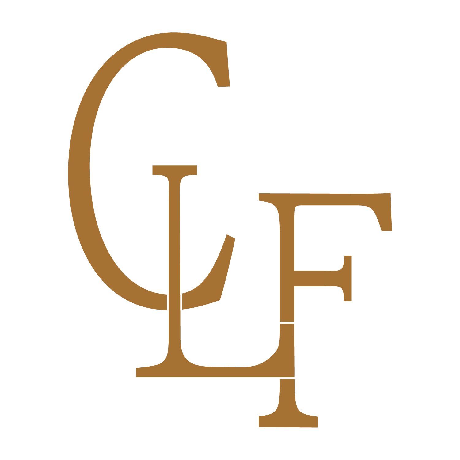

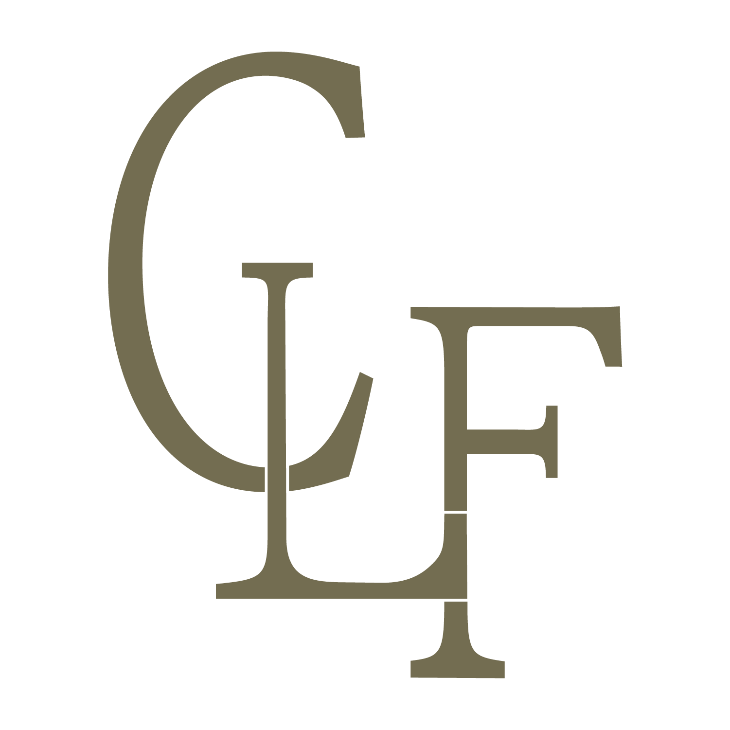
Logo Icon Design:
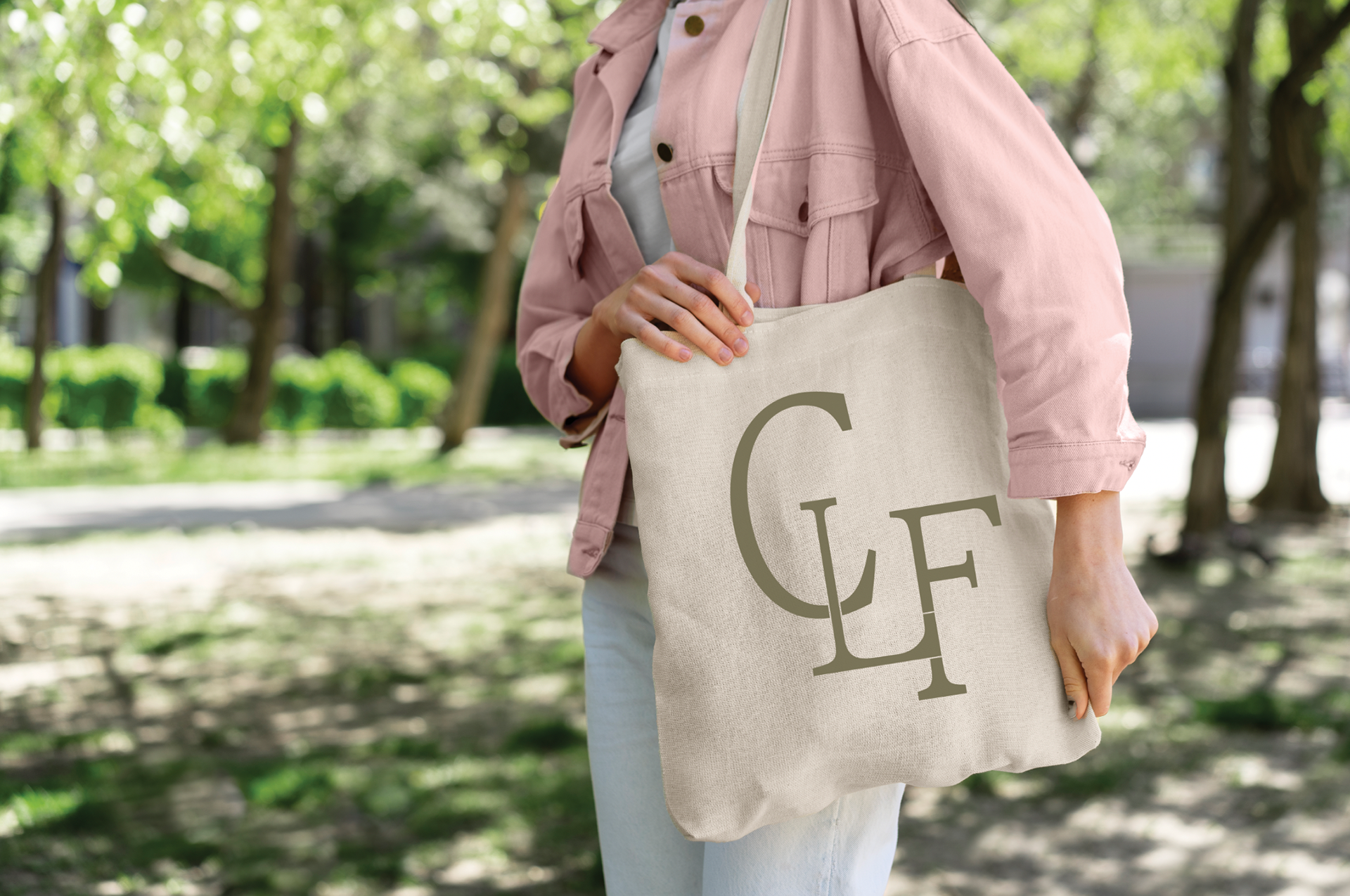
When thinking about a logo concept, we were mostly inspired by Cattle Brands. Seeing that this is a farm, we felt it was more than fitting. By utilizing a serif typeface and configuring the initials in a "cattle brand" way, I feel we accomplished this concept well.
Logo Variations:
Based on their budget for this project, we decided on 2-3 logo variations. When considering how to configure these variations, I thought about the different situations they would encounter.
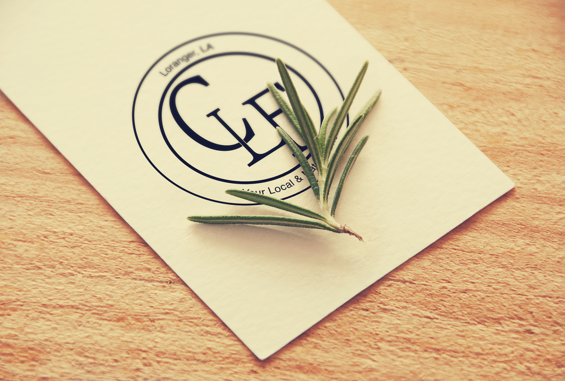
By having a circular orientation to the logo, this opens up the ideal format for circular stickers and labels. These labels can be used on local produce and various packagings.
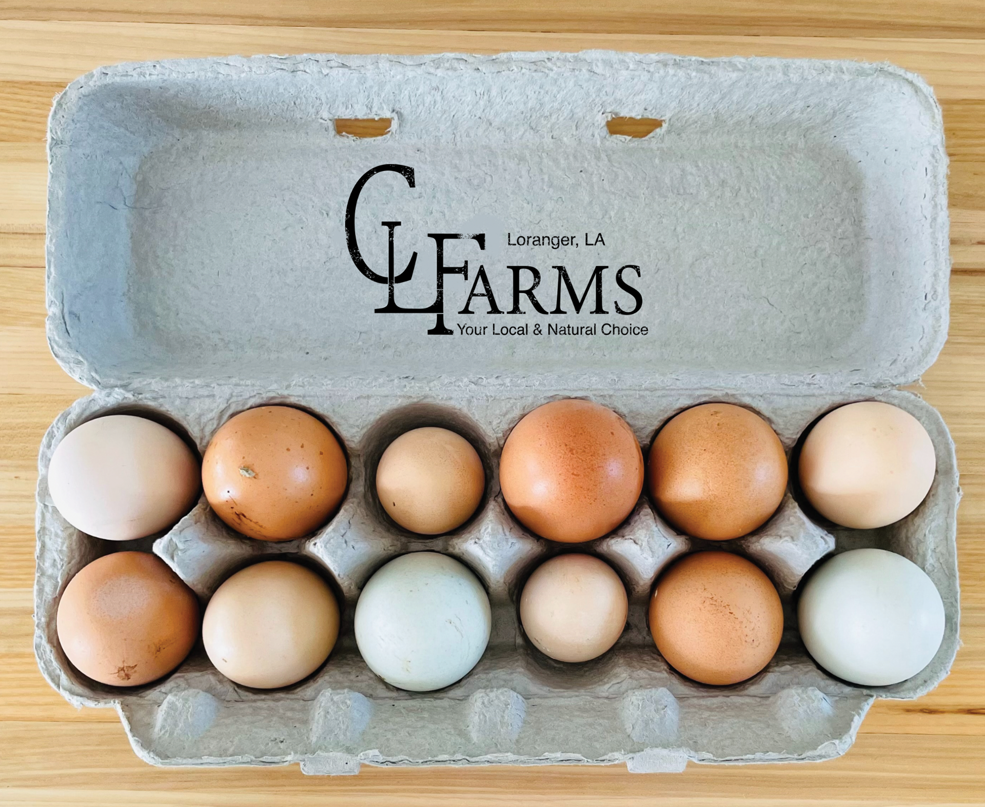
For the more elongated variations, I was inspired by an ink stamp. This orientation is perfect for packaging, egg cartons, posters, signage, etc.
